UX design
Workshops with the Museum’s team, user journeys and wireframes for each kiosk. Short, clear interactions with no waiting, designed for Clara and Tristan, the exhibition’s two personas.
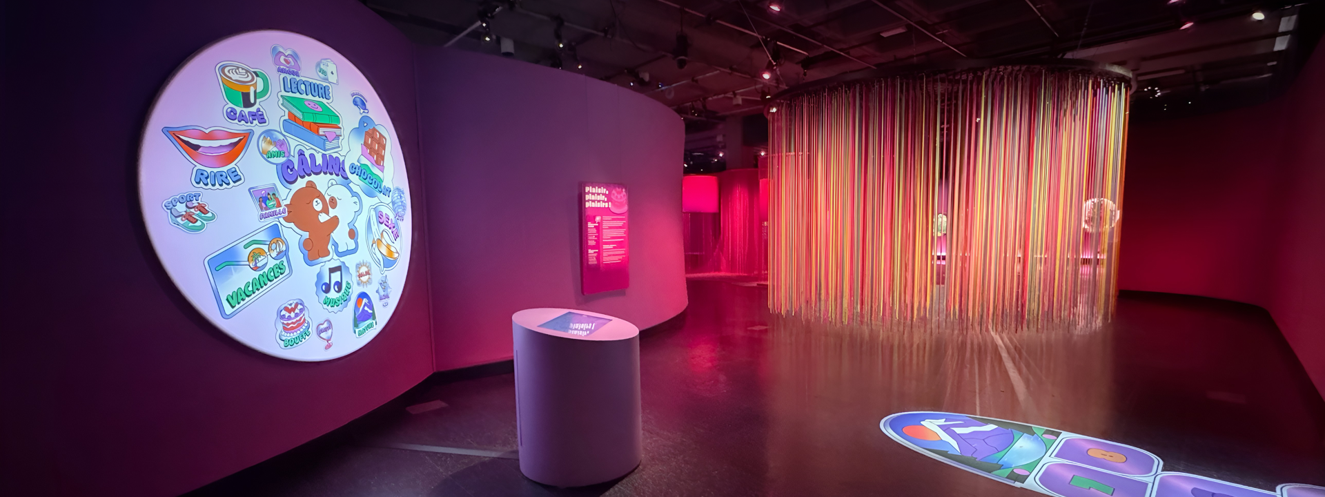
From May 6, 2026 to April 18, 2027, the Musée de la civilisation presents Plaisirs, a colourful exhibition where you learn as much as you have fun. It promises to explore pleasure in all its forms.
The Museum entrusted us with the UX/UI design of five interactive installations spread across the exhibition’s zones, as well as the development of two kiosks. We designed a participatory word cloud, a hybrid board game and three content kiosks. Each installation has its own personality, but the experience had to remain consistent from one zone to the next.
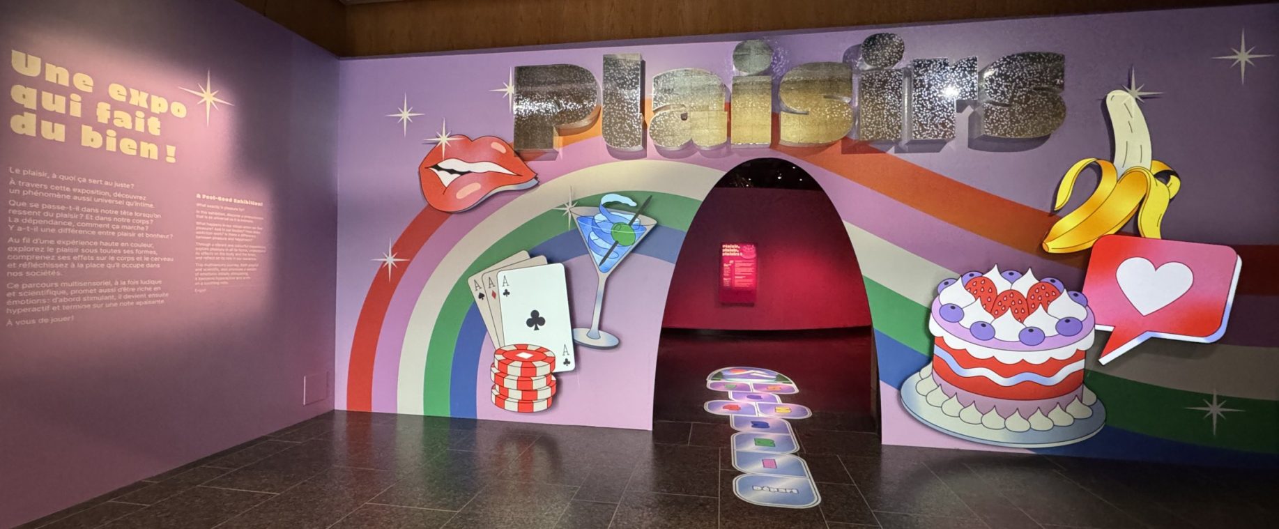
L'entrée de l'exposition Plaisirs
Supporting the Museum’s team from ideation to deployment, aligning every interface with the exhibition’s art direction.
The Museum chose to focus first on millennials and Gen Z, a generation whose happiness has been declining in Canada in recent years. Two personas guided every one of our design decisions.
Each kiosk has its own purpose and borrows the atmosphere of the zone it’s in. To help visitors find their way from one zone to the next, we kept shared cues: a home button, navigation principles, and similar animations and micro-interactions.
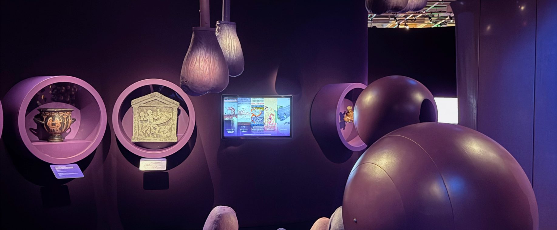
Zone 1 · Plural pleasures
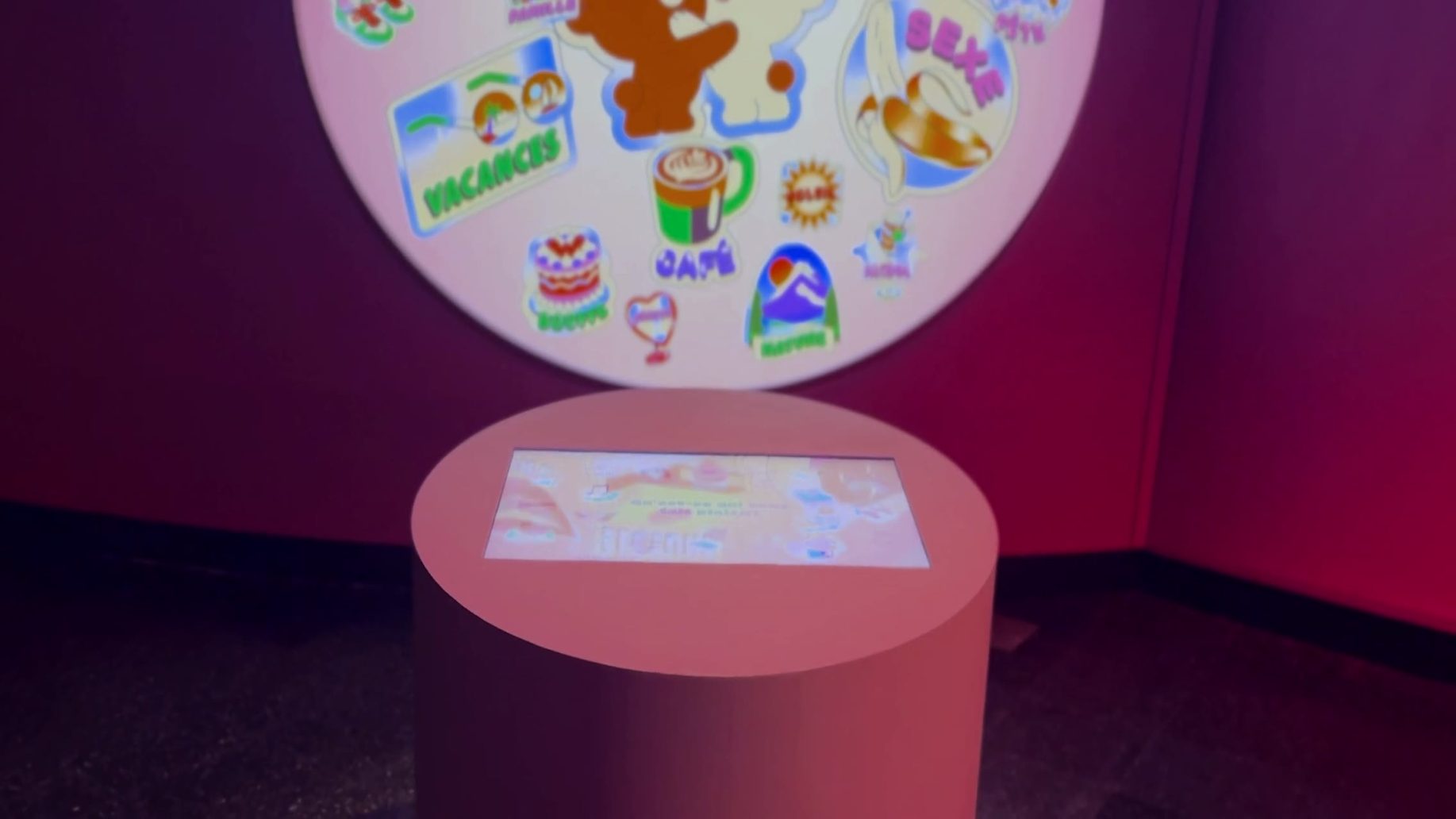
The first stop on the visit, the word cloud sets the tone for the exhibition. On a screen on a pedestal in the centre of the room, a question awaits: “What brings you pleasure?” The kiosk offers some twenty illustrated words. Visitors choose one and send it into the projected cloud, where it grows with each vote. In just a few seconds, everyone sees where they stand compared to others and takes part in a collective artwork that evolves throughout the exhibition.
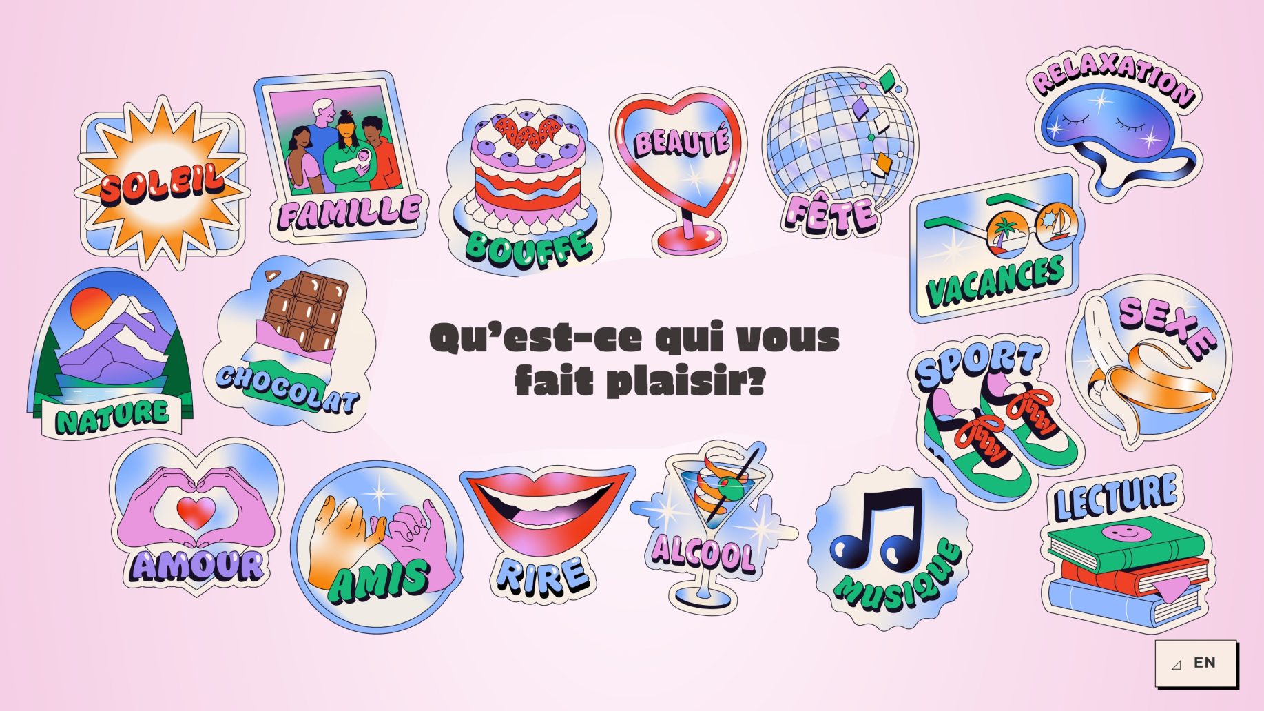
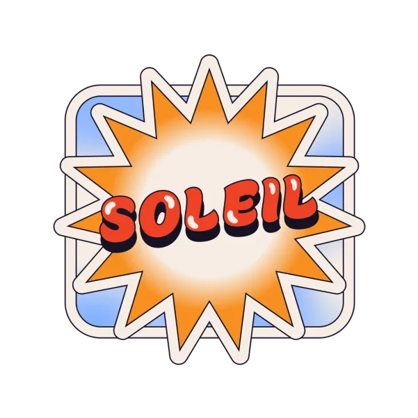
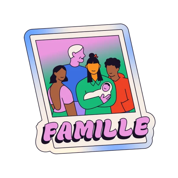
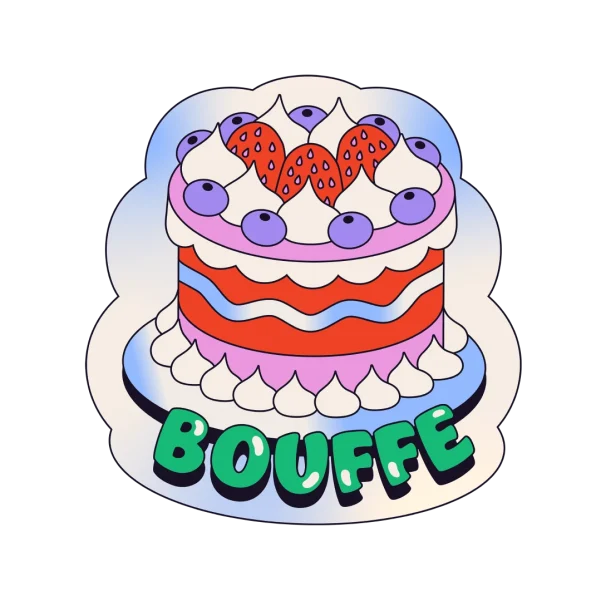
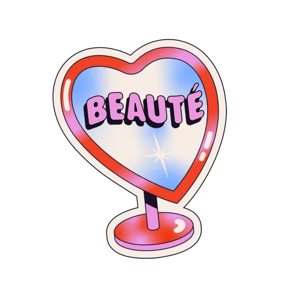


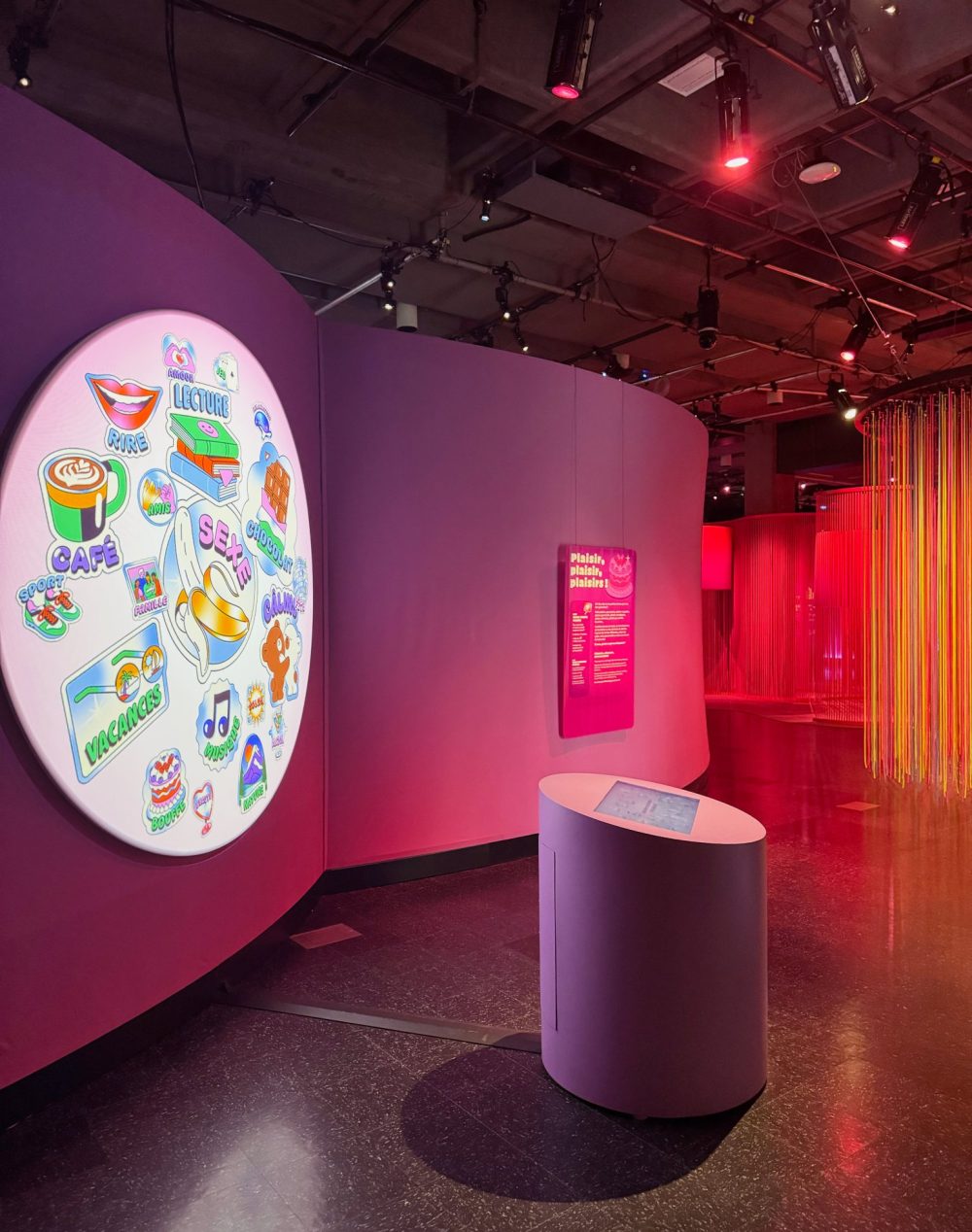
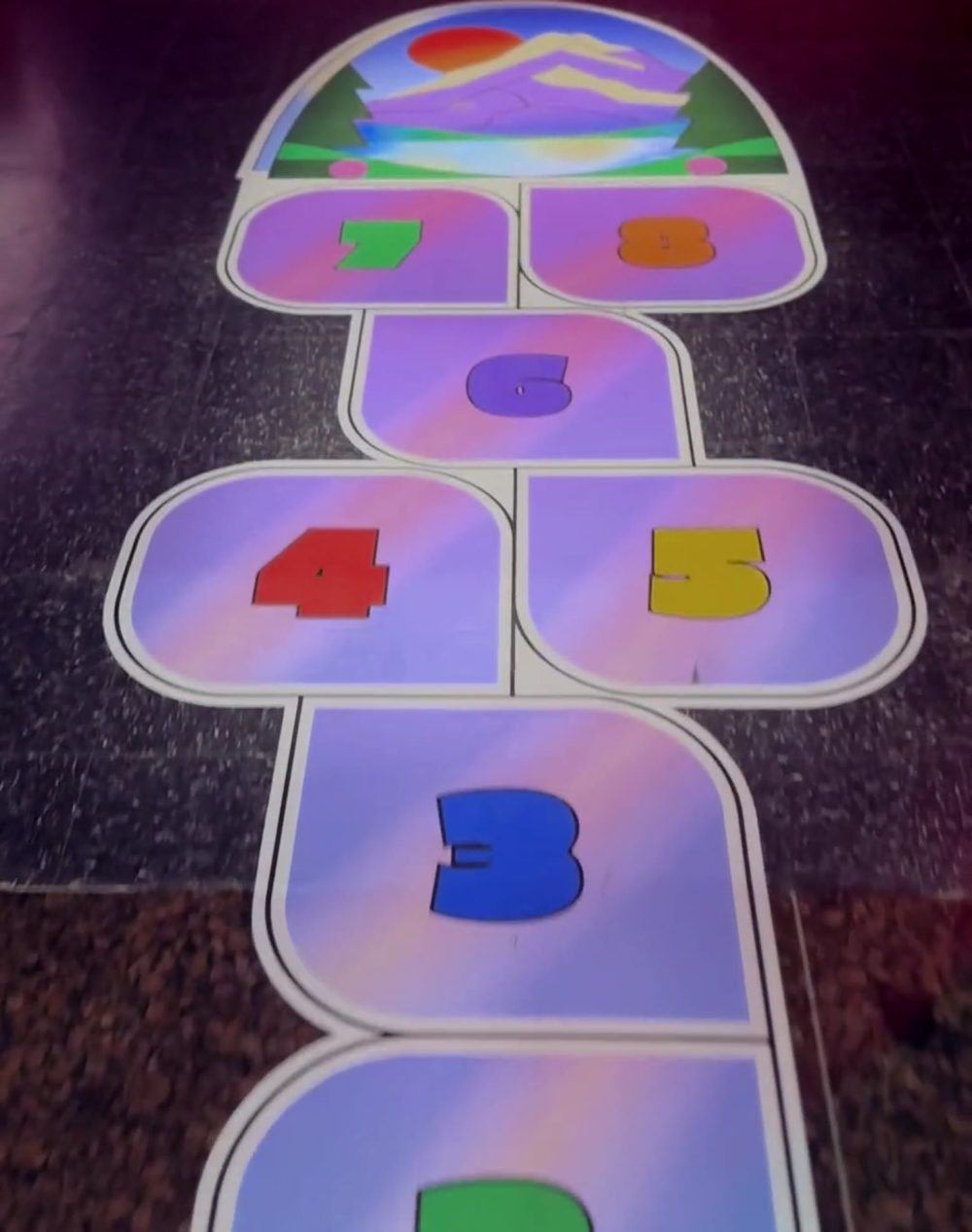
Left: the word cloud projection / Right: the hopscotch game at the exhibition entrance that guides visitors to our kiosks
Zone 2 · Sexual pleasure
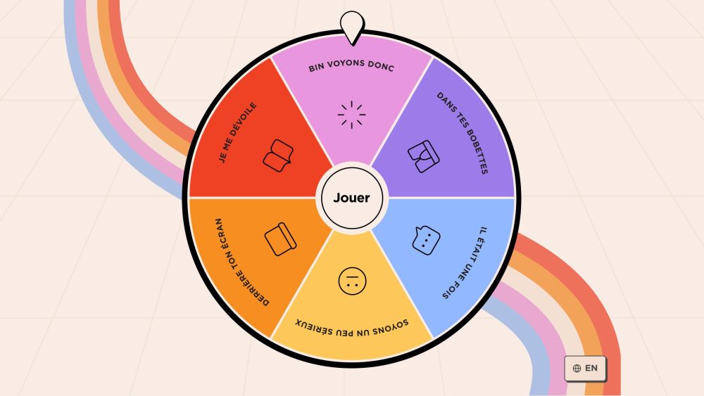
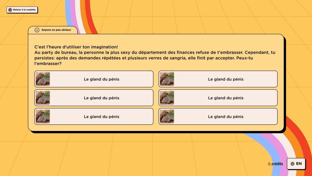
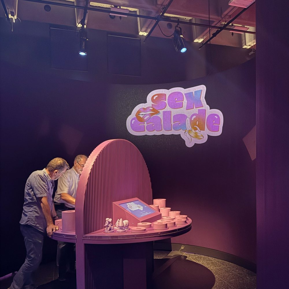
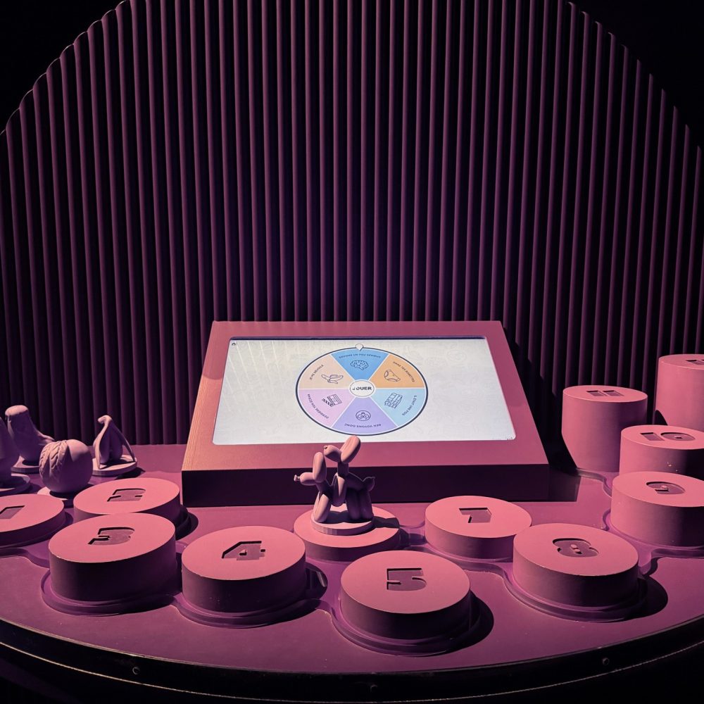
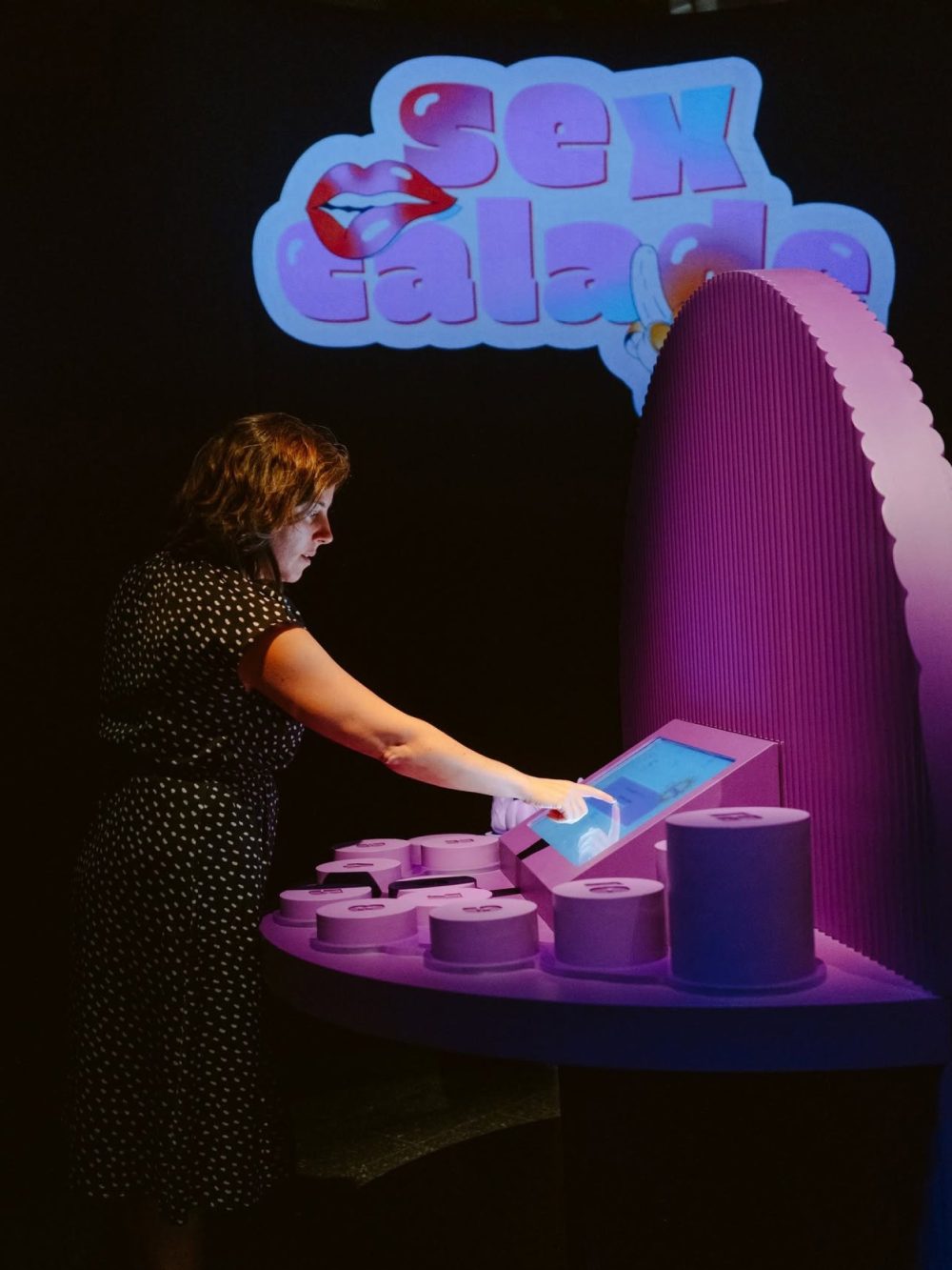
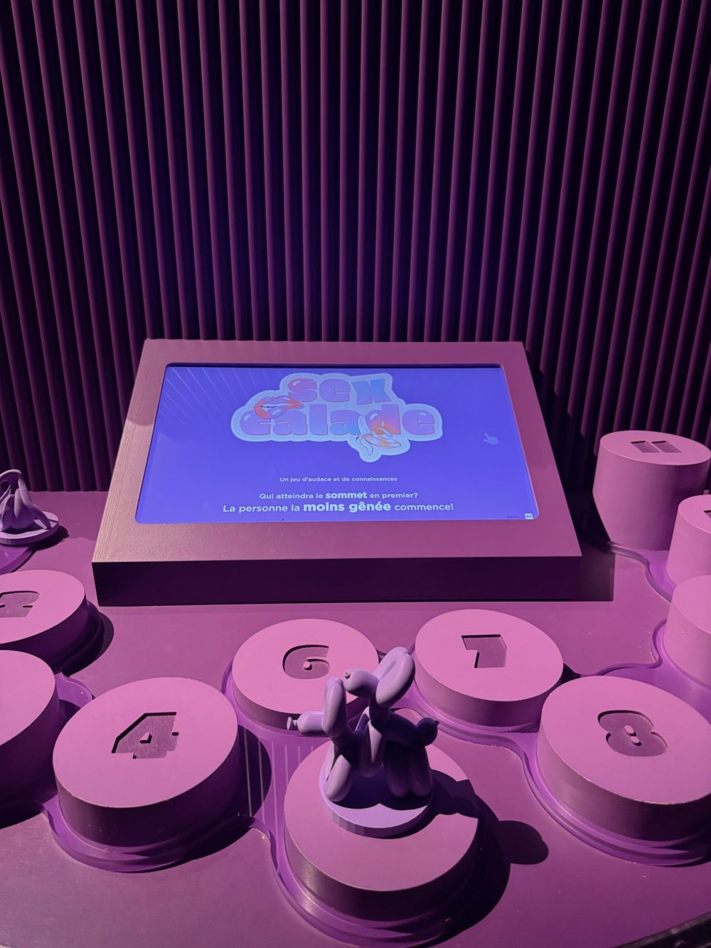
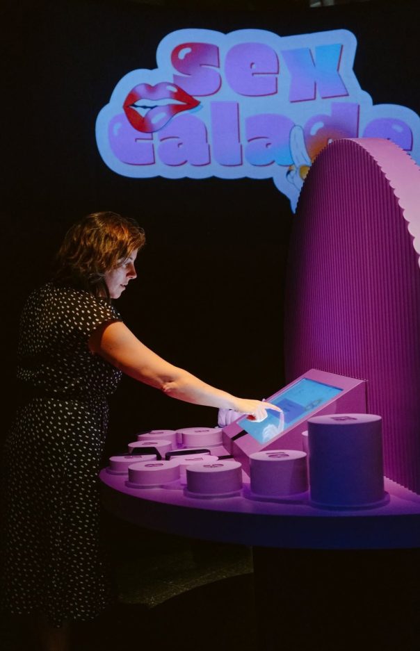
A hybrid game, half physical, half digital, for talking about sexual pleasure without (much) embarrassment. Two to four players choose an oversized cheeky game piece, spin the wheel on screen and answer questions in six categories, from “In your undies” to “Opening up”. Visitors who answer correctly move forward on the giant board. The challenge was to stay inclusive and funny, never “cringe”, while sharing real knowledge.
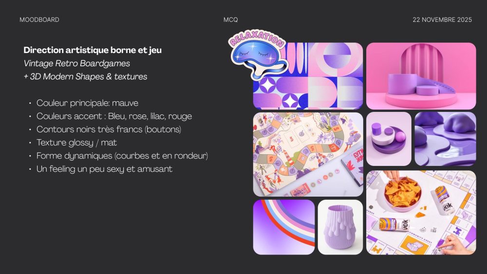
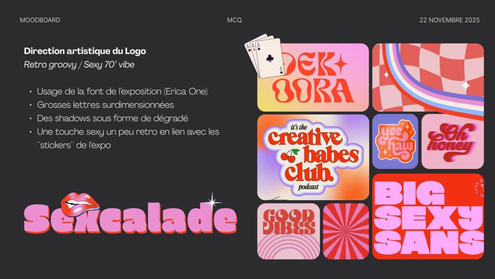
Moodboards: art direction for the game and logo, retro groovy and sexy 70s
We designed the game board concept in 3D: a 12-space path of bubble-shaped tiles, with measurements, elevations and real colour tests. The Museum then built it and installed it in the gallery.
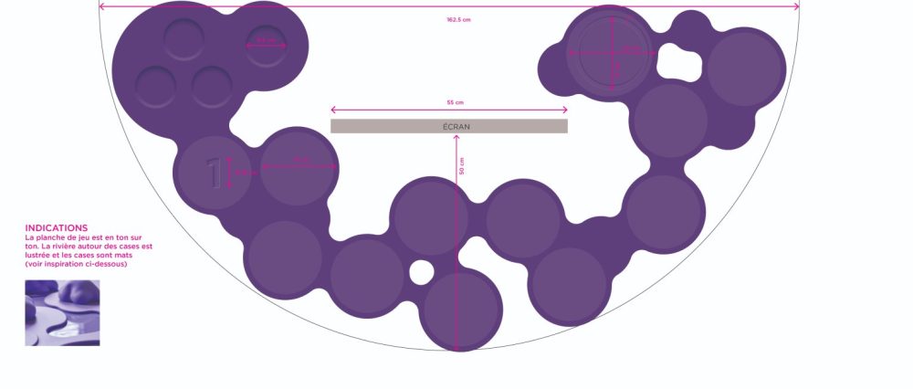
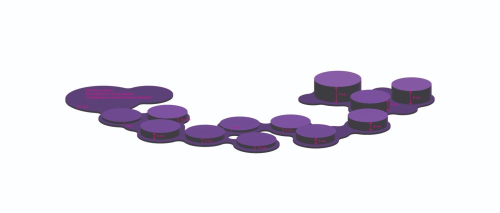
Design plans: board measurements and elevations
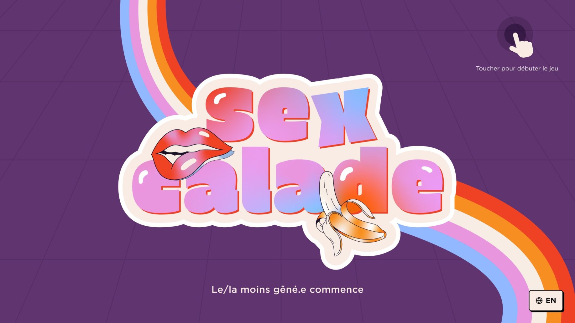
Zone 2 · Sexual pleasure
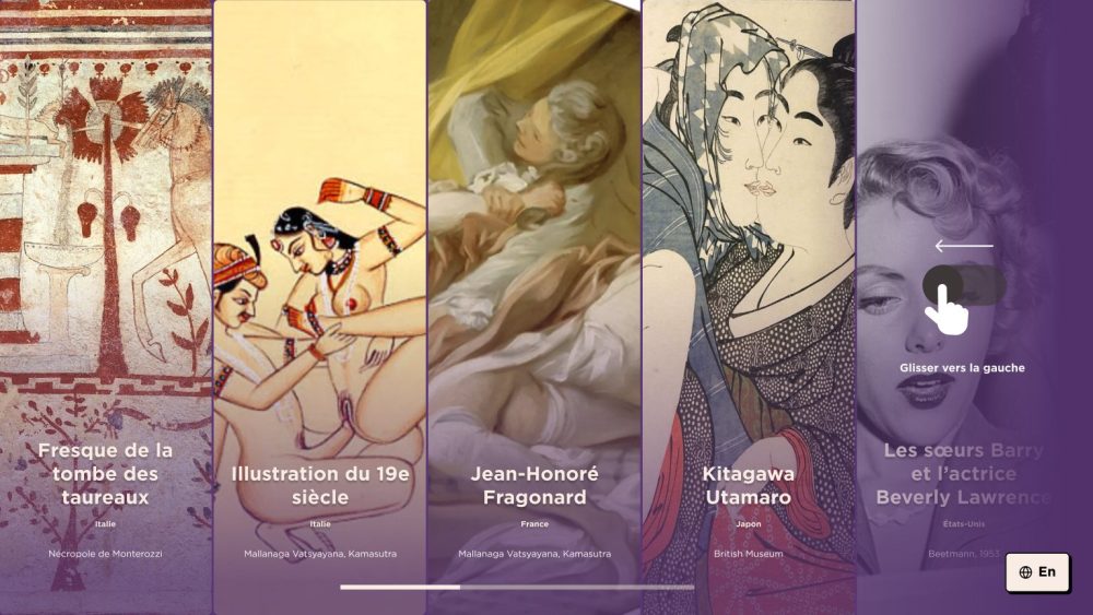
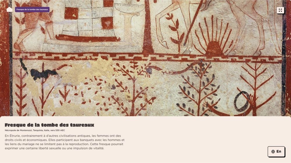
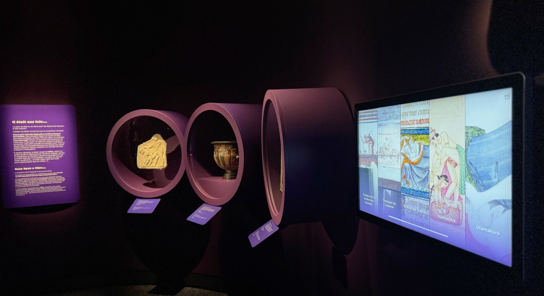
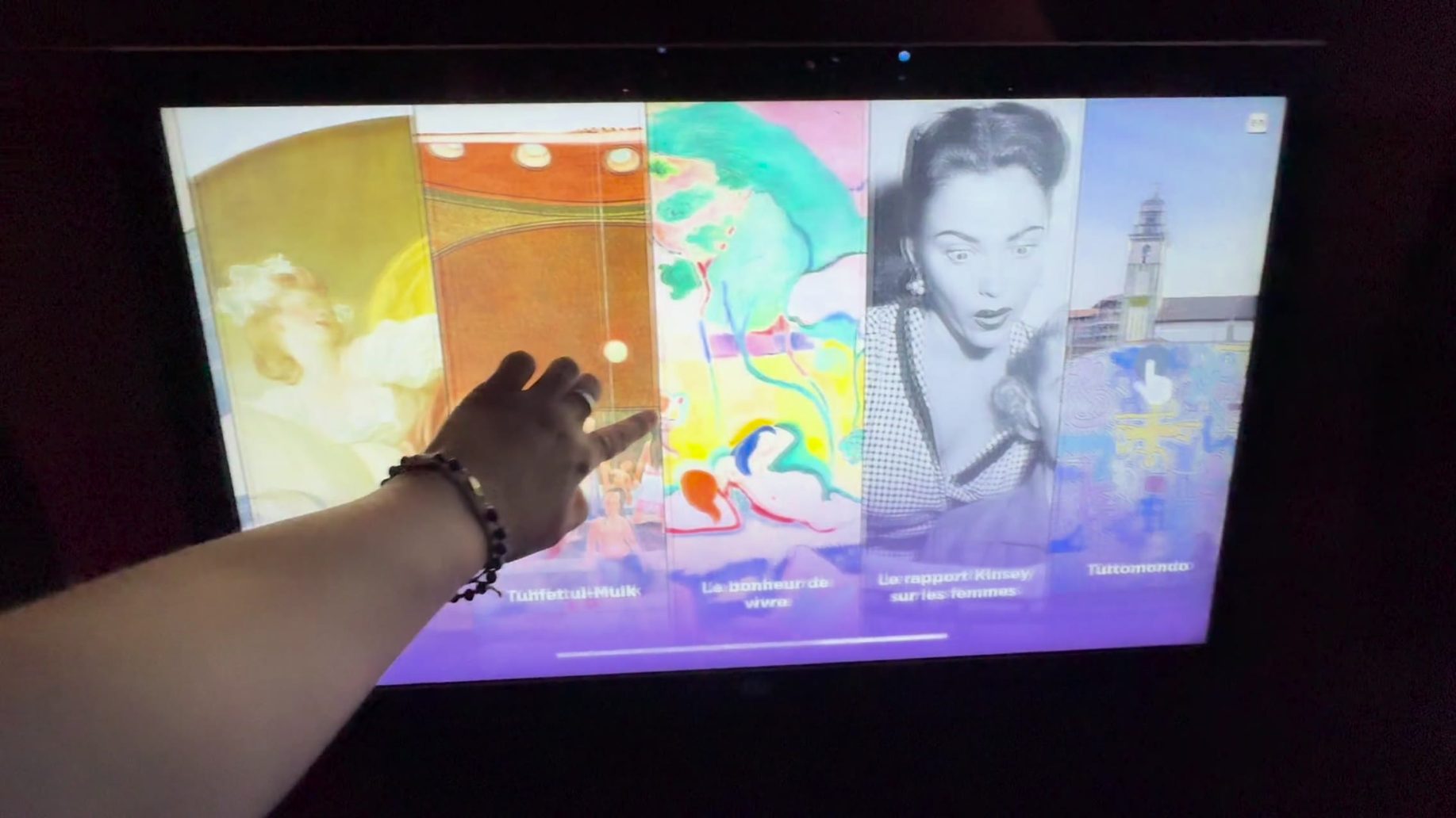
For some historical documents and collection objects, the Museum only had digital images. This kiosk brings them into the zone, alongside the display cases. Visitors browse from one work to the next and discover its explanatory caption. Simplified navigation, no detours, just the content.
Zone 5 · Pleasure or happiness
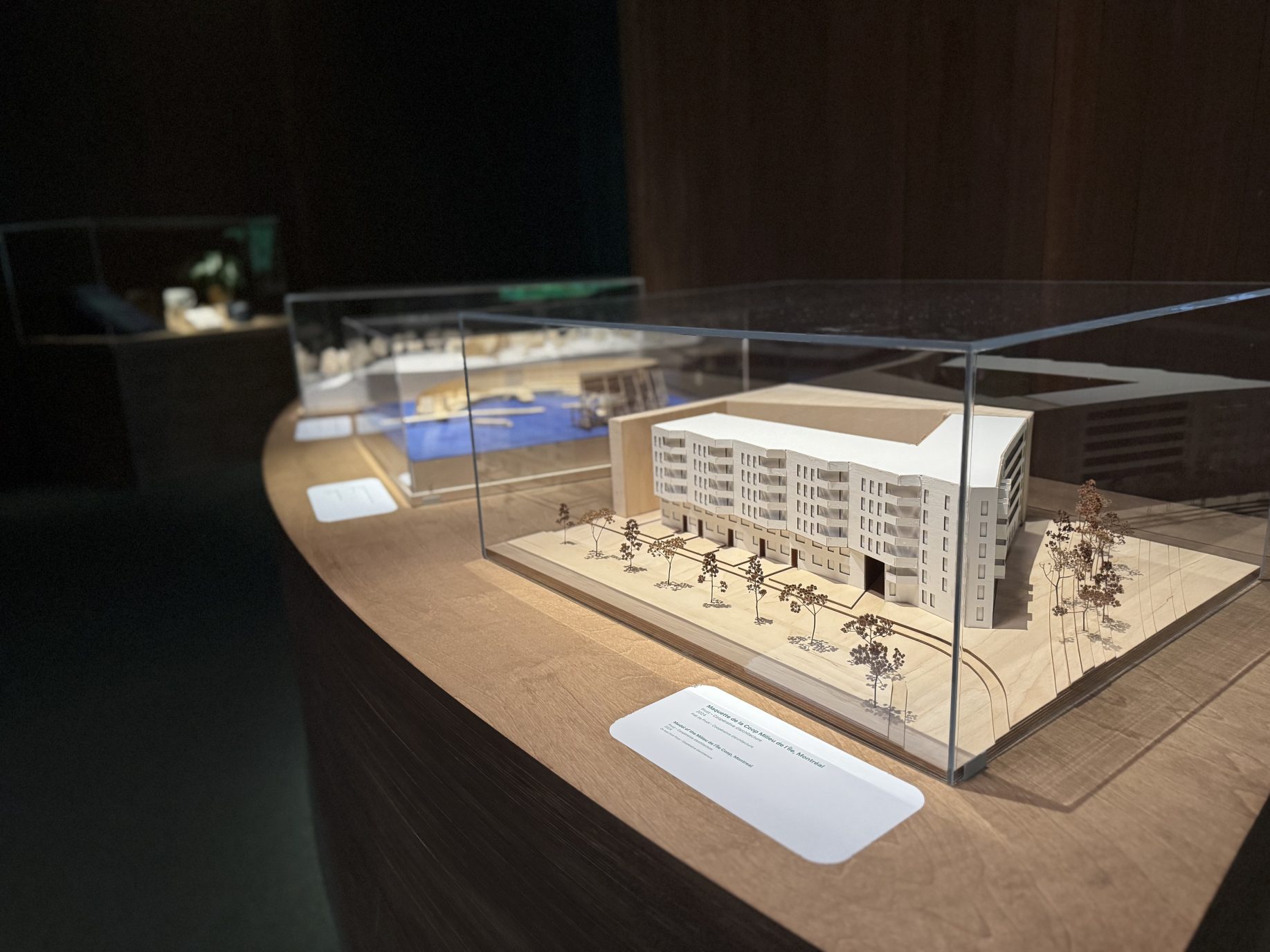
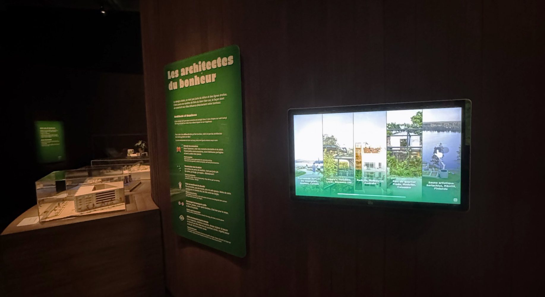
Alongside the physical models, this kiosk showcases some fifteen places and buildings that illustrate urban planning centred on human well-being. A home page presents all the options; each entry gives the architect’s name, the location, a short text and a few images.
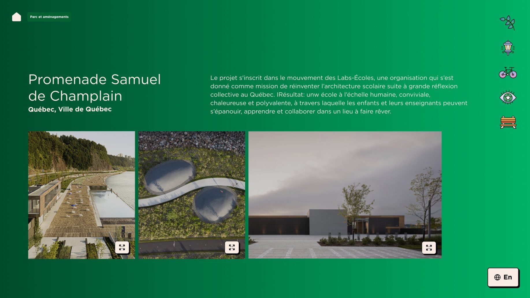
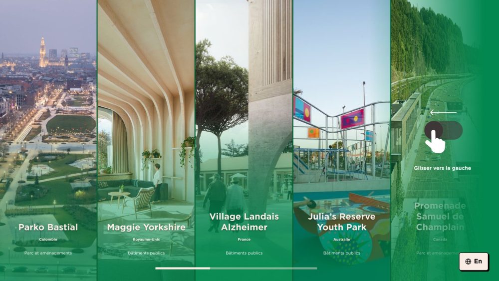
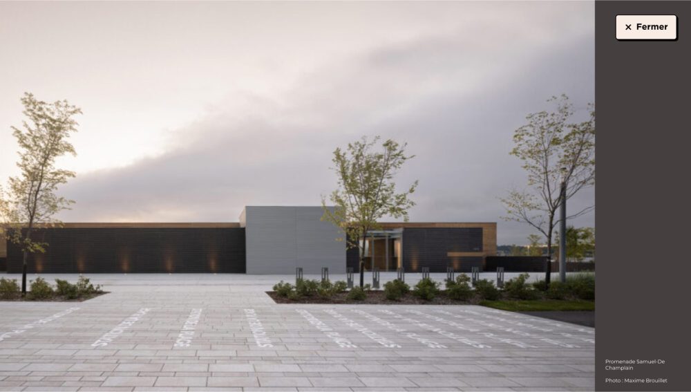
Zone 5 · Pleasure or happiness
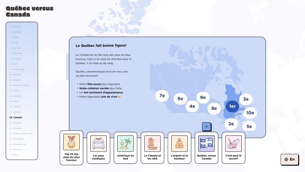
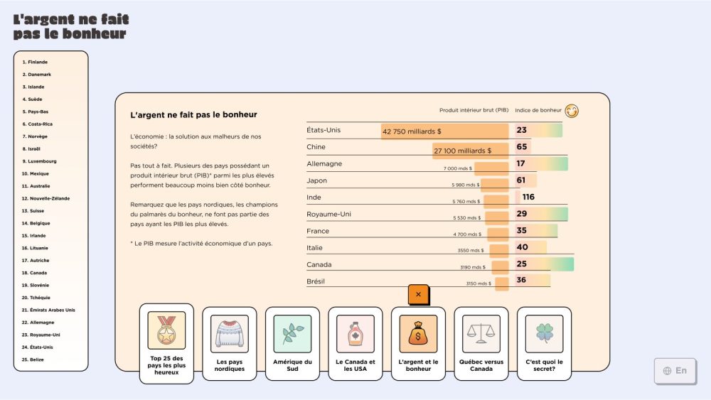
A giant 4K touchscreen for exploring data from the World Happiness Report. A world map offers thematic tabs (from the top 25 happiest countries to Quebec versus Canada) and highly condensed content, supported by pictograms. One visitor navigates while others can look over their shoulder. The menu was placed to be accessible to all visitors: children, adults, and people using mobility devices or not.
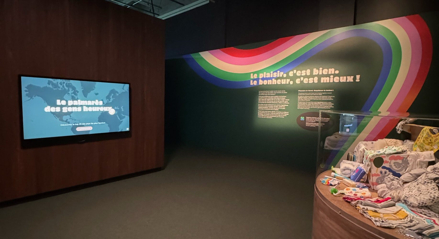
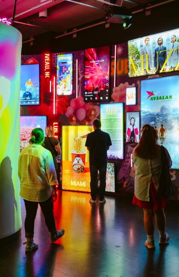
Gallery atmosphere, opening and visitors: a few images of Plaisirs captured by the Museum’s team.
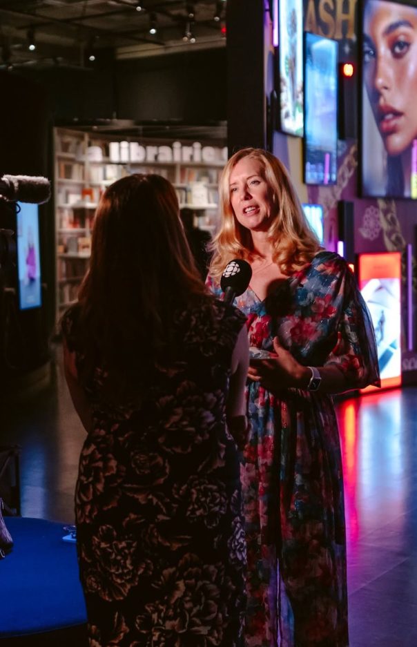
Photos: © Musée de la civilisation

Passionate about entrepreneurship and technology, Christopher combines expertise in backend software development with a specialization in data analysis. After five...

Passionate about web development and technology, Olivier built his expertise working at several well-known web agencies and companies. A software...

Ambitious and meticulous, Cynthia stands out for her ability to bring strong, consistent visual identities to life, where every detail...

Passionate about the possibilities of collaborative design, Julie had long dreamed of launching the Collective. Her first intention was to...
